Graphical Representation of Data Class-6 RS Aggarwal ICSE Maths Goyal Brothers Prakashan Chapter-25 Solutions. We provide step by step Solutions of Exercise / lesson-25 Graphical Representation of Data of Plane Figure for ICSE Class-6 RS Aggarwal Maths.
Our Solutions contain all type Questions with Exe-25 A and Exe-25 B with Notes on Graphical Representation of Data to develop skill and confidence. Visit official Website CISCE for detail information about ICSE Board Class-6 Mathematics.
| Board | ICSE |
| Publications | Goyal brothers Prakshan |
| Subject | Maths |
| Class | 6th |
| Chapter-25 | Graphical Representation of Data |
| Writer | RS Aggrawal |
| Book Name | Foundation |
| Topics | Solution of Exe-25 A and Exe-25 B |
| Academic Session | 2021-2022 |
Graphical Representation of Data Class-6 RS Aggarwal ICSE Maths Goyal Brothers Prakashan Chapter-25 Solutions
– : Select Topics :-
- The pictograph is a pictorial representation of data.
- Here data is represented using images of the objects.
Pictograph
A pictograph represents data in the form of pictures, objects or parts of objects. The picture usually helps to understand the data. It helps answer the questions on the data at a glance. Pictographs are often used by dailies and magazines to attract the attention of the readers. However, it requires some practice to understand the information given by a pictograph.
Interpretation of a Pictograph
Simply by observing a pictograph, one can answer the related questions very quickly.
Drawing a Pictograph
We draw pictographs using symbols to represent a certain number of items or things.
What is Pictographs
A pictograph is the representation of data using images. Pictographs represent the frequency of data while using symbols or images that are relevant to the data. This is one of the simplest ways to represent statistical data. And reading a pictograph is made extremely easy as well. The best way to explain a pictograph is through an example
How to make a Pictograph
Let us take an example. We must represent how many TV sets have been sold in the last few years via a pictograph. So we get started
- Collect Data: First step is obviously collecting the data of the category you want to represent. Collect your data by appropriate means. And then make a list or table of the data. And one time finally review the data.
- Pick your symbol: Pick a symbol or picture that accurately represents your data. If you are drawing a pictograph to represent TV sets sold then a symbol of a basketball would be highly confusing! So pick your symbol carefully.
- Assign a Key: Sometimes the frequency of the data is too high. Then one symbol cannot represent one frequency. You must set a numerical value that one symbol will represent. This numerical value must be written along with the pictograph.
- Draw the pictograph: Final step is drawing your pictograph. Draw the two columns that represent the category and the data. Then draw the actual symbols that represent the frequencies. Remember that the symbols can be drawn as fractions as well if the frequency is not a whole number.
- Review your Data: And finally, review your pictograph and make sure it correctly represents the information that you wanted to relay. Don’t forget to check the labelling of your graph
Advantages of a Pictograph
- Express a large amount of information or data in a simple form
- Since they make the use of symbols, pictographs attract attention i,e, it is an attractive way to represent data
- Pictographs are easy to read since all the information is available at one glance
- And since pictographs are universally used they do not require a lot of explanation
Exe-25 A
Graphical Representation of Data Class-6 RS Aggarwal ICSE Maths Goyal Brothers Prakashan Solutions
Page 275
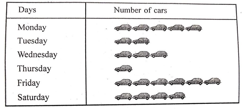
Question 1:
The number of cars sold at a showroom during a week are given below :
| Day | Monday | Tuesday | Wednesday | Thursday | Friday | Saturday |
| Number of cars sold | 15 | 6 | 9 | 3 | 18 | 12 |
Choose an appropriate scale and draw a pictograph to represent the given data.
Answer :
Scale used is car = 3 cars sold
Question 2:
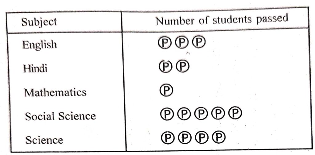
In a class test, the number of student passed in various subjects are given below :
| Subject | English | Hindi | Mathematics | Social | Science |
| Number of students passed | 15 | 10 | 5 | 25 | 20 |
Draw a pictograph to represent the above data.
Answer :
Scale used is Ρ = 5 students passed
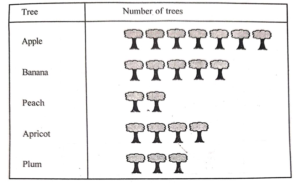
Question 3:
The number of tree of various kinds in a fruit orchard are given below :
| Tree | Apple | Banana | Peach | Apricot | Plum |
| Number of tree | 56 | 40 | 16 | 32 | 24 |
Represent the above data by a pictograph.
Answer :
Scale used is tree = 8 tree
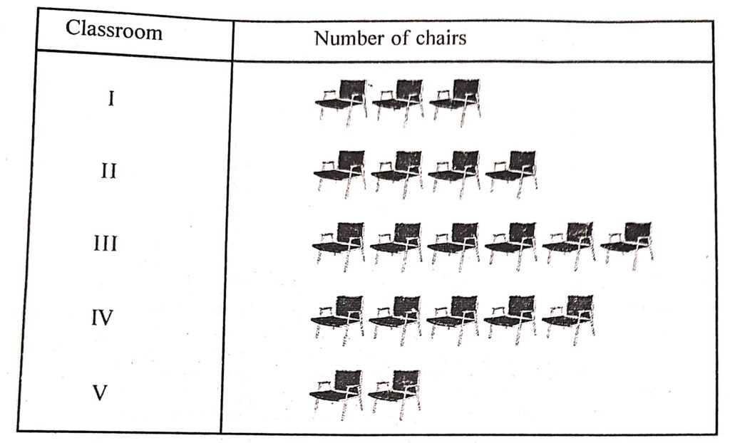
Question 4:
The number of chairs in five classroom of a school are given below :
| Classroom | I | II | III | IV | V |
| Number of chair | 30 | 40 | 60 | 50 | 20 |
Represent the above data by a pictograph.
Answer :
Scale used is chair = 10 chairs
Question 5:
The following pictograph shows the number of computer sold by a showroom during a week the scale used is : computer = 6 computers.
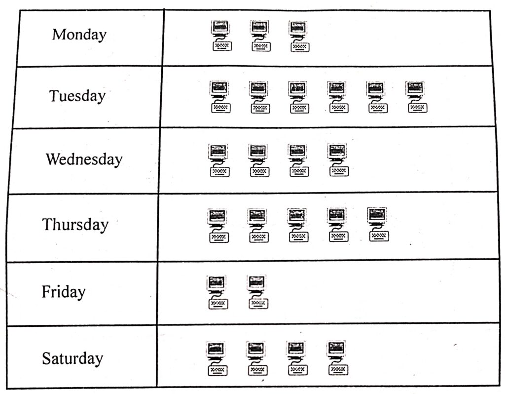
Look at the above pictograph and answer the questions given below :
(i) On which day the minimum number of computers were sold ?
(ii) How many computers were sold on Thursday ?
(iii) On which day the number of computers sold was one-third of that sold on Tuesday ?
(iv) How many computers were sold in all during the week?
(v) What is the difference between the maximum and minimum number of computers sold in a day?
Answer :
(i) 0n Friday, minimum 2 computers were sold.
(ii) 5 computers were sold on Thursday.
(iii) Number of computers sold on Tuesday =6
One third of computers sold on Tuesday = (1/3) x 6 = 2
Hence, on Friday the number of computers sold was one-third of that sold on Tuesday.
(iv) Computers sold of Monday = 3
Computers sold of Tuesday = 6
Computers sold of Wednesday = 4
Computers sold of Thursday = 5
Computers sold of Friday = 2
Computers sold of Saturday = 4
Hence, total number of computers sold during the week
= 3 + 6 + 4 + 5 + 2 + 4 = 24 computers
(v) Maximum number of computers sold ie. on Tuesday = 6
Minimum numbers of computers sold i.e. on Friday = 2
So, Their difference = 6 – 2 = 4 computers
Exe-25 B
Graphical Representation of Data Class-6 RS Aggarwal ICSE Maths Goyal Brothers Prakashan Solutions
Page 277-279
Question 1:
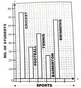
The following tables shows the favourite sports of 250 student in a school.
| Sports | Cricket | Football | Tennis | Badminton | Swimming |
| Number of chair | 75 | 35 | 50 | 25 | 65 |
Represent the data by a column graph.
Answer :
Question 2:
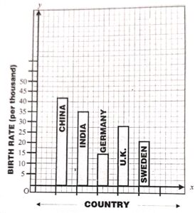
The birth rate per thousand of five countries over a period of time is shown below.
| Country | China | India | Germany | U.K. | Sweden |
| Marks obtained | 42 | 35 | 14 | 28 | 21 |
Represent the above data by a bar-graph.
Answer :
Question 3:
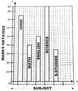
The mark obtained by a student in his annual examination in various subjects are given below :
| Subject | Hindi | Maths | English | Science | S. Studies |
| Marks obtained | 75 | 40 | 50 | 85 | 35 |
Represent the above data by a bar-graph.
Answer :
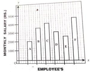
Question 4:
The table given below depicts the monthly salary (in Rs.) of six employees of a company :
Answer :
Represent the above data by a bar-graph.
| Employees | A | B | C | D | E | F |
| Monthly salary (Rs.) | 2000 | 3500 | 4000 | 3000 | 2500 | 4500 |
Question 5:
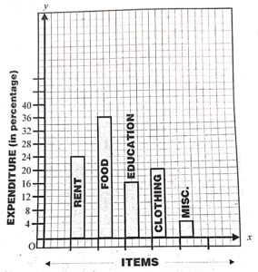
The table given below shows the monthly expenditure on various items, in a family.
| Item | Rent | Food | Education | Clothing | Misc. |
| Expenditure | 24% | 36% | 16% | 20% | 4% |
Answer :
Represent the above data by a column-graph.
Question 6:
Read the given column-graph and answer the question that follow :
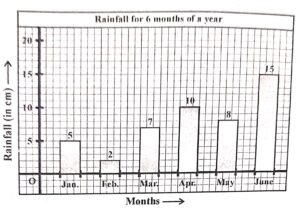
(i) What information is represented by the column-graph ?
(ii) In which months was the rainfall maximum ?
(iii) Which month was the driest ?
(iv) What was the rainfall in March ?
(v) Find the total amount of rainfall in all the six months taken together.
Answer :
(i) The column-graph shows the rainfall (in cm) at a place during first six months of an year.
(ii) June
(iii) February
(iv) 7 cm
(v) 47 cm (5 +2+7+10+8 + 15)
Question 7:
Read the column-graph given below :
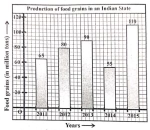
Now, answer the following questions :
(i) What information is represented by the column-graph ?
(ii) What was the production of food grains in 2013 ?
(iii) In which year the production was maximum ?
(v) After which year there was a sudden fall in the production ?
(vi) Find the percentage increase in the production of food grains in the year 2015.
Answer :
(i) The column-graph shows the production of food grains in an Indian state during the year 2011 to 2015.
(ii) 90 million tons.
(iii) The production was maximum in the year 2015.
(iv) In year 2013 there was a sudden fall in the production.
(v) Production of food grains in 2014 55 million tons.
(vi) Production of food grains in 2015 -110 million tons
Increase in production of food grains in the year 2015 = (110-55) million tons = 55 million tons
% change in the production of food grains in the year 2015 = (55/55) x 100 = 100%
Question 8:
In a survey of 130 families of a colony, the number of children in each family was recorded and the data has been represented by the bar graph, given below :
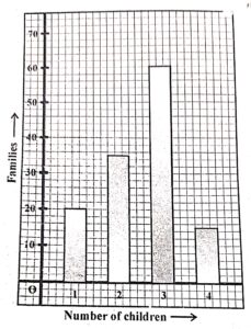
Read the bar graph carefully and answer the questions given below :
(i) What information does the bar graph give ?
(ii) How many families have 2 children 7
(iii) How many families have no child ?
(iv) What percentage of families have 4 children ?
Answer :
(i) The bar graph shows the number of children in each of the 130 families of a colony.
(ii) 35 families have 2 children
(iii) Total families 130
Families having 1 child = 20
Families having 2 child = 35
Families having 3 child = 60
Families having 4 child = 15
Families having 0 child= 130-(20+ 35 + 60+ 15)
= 130 – 130 =0
None of the family have 0 children.
(iv) Total families = 130
Families having 4 children = 15
% age of families having 4 children = (15 x 100)/130
= 11(7/13)%
FAQs on Pictographs?
Question 1: What are Pictographs?
Answer: A pictograph refers to the representation of data by making use of images. Pictographs represent the occurrence of data by making use of symbols or images that are pertinent to the data. It is one of the easiest ways to represent statistical data. Moreover, it is very easy to read a pictograph.
Question 2: What is a pictograph key?
Answer: We use a key to identify the number of categories which are present in a graph. We also refer to it as a legend. Thus, a key on a pictograph let us know many each picture stands for.
Question 3: What is the use of pictograph?
Answer: A pictograph makes use of picture symbols to express the meaning of statistical information. We must make use of pictographs cautiously because the graphs may, either unintentionally or on purpose, misrepresent the data. Thus, it is essential to make it visually accurate.
Question 4: What are the advantages of a Pictograph?
Answer: A pictograph helps in expressing a large amount of data in a simpler form. Further, the symbols in them help in attracting attention and gives a smart way of representing data. In fact, they are quite easy to read since you get all the information in one glimpse and do not need a great deal of explanation
: End of Graphical Representation of Data Class-6 RS Aggarwal Solutions :–
Return to- RS Aggarwal Solutions for ICSE Class-6 Goyal Brothers Prakashan
Thanks


2 thoughts on “Graphical Representation of Data Class-6 RS Aggarwal ICSE Maths Goyal”
Very nicely and beautiful way of explaining and satisfied
thanks a lot for positive response