
Graphical Representation of Statistical Data Class 10 RS Aggarwal Exe-24 ICSE Maths Solutions Ch-24. In this article you will get the solved practice questions / problems on Graphical Representation of Statistical Data using frequency polygon. Visit official website CISCE for detail information about ICSE Board Class-10.


Graphical Representation of Statistical Data Class 10 RS Aggarwal Exe-24 ICSE Maths Solutions Ch-24
| Board | ICSE |
| Publications | Goyal Brothers Prakashan |
| Subject | Maths |
| Class | 10th |
| Chapter-24 | Graphical Representation of Statistical Data |
| Writer | RS Aggarwal |
| Book Name | Foundation |
| Topics | representing data on histogram and frequency polygon |
Representing Data on Histogram and Frequency Polygon
Class 10 RS Aggarwal Exe-24 ICSE Maths Solutions Ch-24.
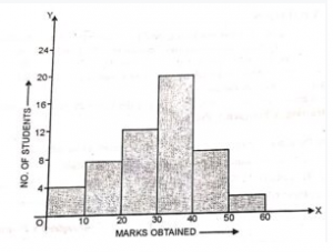
Que-1: Draw a histogram to represent the following data :
Marks obtained |
0-10 |
10-20 |
20-30 |
30-40 |
40-50 |
50-60 |
No. of students |
4 |
7 |
12 |
20 |
9 |
2 |
Sol:
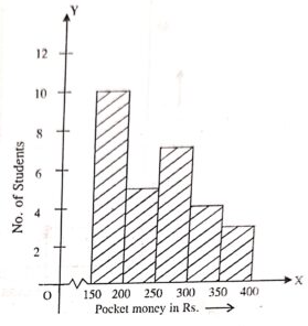
Que-2: Draw a histogram to represent the following data :
Pocket money(in rupees) |
150-200 |
200-250 |
250-300 |
300-350 |
350-400 |
No. of students |
10 |
5 |
7 |
4 |
3 |
Sol:
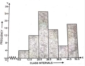
Que- 3: Construct a histogram for the following frequency distribution :
Class interval |
5-12 |
13-20 |
21-28 |
29-36 |
37-44 |
45-52 |
Frequency |
4 |
12 |
26 |
15 |
6 |
18 |
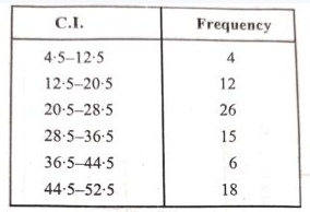
Sol: Clearly , the given frequency distribution is in inclusive form . So, first we convert it to the exclusive form .
Adjustment factor = (13-12/2) = 0.5
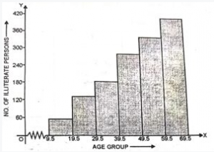
Que-4: The following table shows the number of illiterate persons in the age group (10-69) in a town
Age-Group (in years) |
10-19 |
20-29 |
30-39 |
40-49 |
50-59 |
60-69 |
No. of illiterate persons |
50 |
125 |
190 |
275 |
340 |
410 |
Sol: Clearly , the given frequency distribution is in inclusive form . So, first we convert it to the exclusive form .
Adjustment factor = (20-19/2) = 0.5
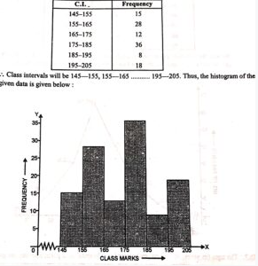
Que-5: Draw a histogram to represent the following data :
Class-Mark |
150 |
160 |
170 |
180 |
190 |
200 |
Frequency |
15 |
28 |
12 |
36 |
8 |
18 |
Sol:
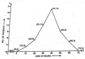
Que-6: In a study of diabetic patients in a village , the following observations were noted:
Age in years |
10-20 |
20-30 |
30-40 |
40-50 |
50-60 |
60-70 |
No. of patients |
2 |
5 |
12 |
19 |
9 |
4 |
Sol: Represent the above data by a frequency polygon –
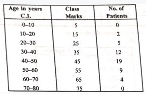
We plot the following points on the graph : (5, 0), (15, 2), (25, 5), (35, 12), (45, 19), (55, 9), (65, 4) and (75, 0) and join them to form a frequency polygon as given below :
Que-7: The ages (in years) of 360 patients treated in a hospital on a particular day are given below
Age in years |
10-20 |
20-30 |
30-40 |
40-50 |
50-60 |
60-70 |
No. of patients |
90 |
40 |
60 |
20 |
120 |
30 |
Sol:
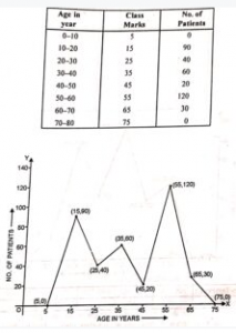
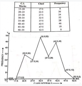
Que-8: Draw a histogram and the frequency polygon from the following data:
Class-interval |
20-25 |
25-30 |
30-35 |
35-40 |
40-45 |
45-50 |
Frequency |
30 |
24 |
52 |
28 |
46 |
10 |
Sol:
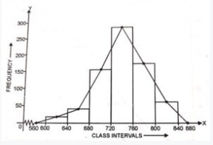
Que-9: Draw a histogram for the following data:
Class-interval |
600-640 |
640-680 |
680-720 |
720-760 |
760-800 |
800-840 |
Frequency |
18 |
45 |
153 |
288 |
171 |
63 |
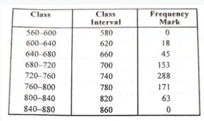
Sol: The given data with class mark of each class interval :
First we draw a histogram, then polygon.
Now, plotting the mid points –
Que-10: Draw an ogive to represent the following data :
Class-interval |
400-450 |
450-500 |
500-550 |
550-600 |
600-650 |
650-700 |
700-750 |
Frequency |
16 |
25 |
40 |
32 |
18 |
27 |
9 |
Sol: The table in cumulative frequency form,
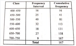
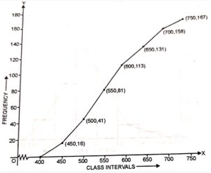
Now, plot the point (450, 16), (500, 41), (550, 81), (600, 113), (650, 131), (700, 158) and (750, 167) on the graph and join them in free hand to get an ogive as shown in the figure.
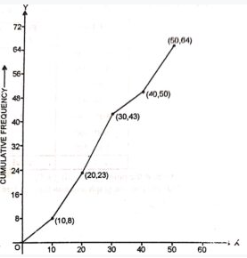
Que-11: Draw an ogive for the following frequency distribution:
Marks obtained |
Less than 10 |
Less than 20 |
Less than 30 |
Less than 40 |
Less than 50 |
No. of students |
8 |
23 |
43 |
50 |
64 |
Sol: The cumulative frequency table :
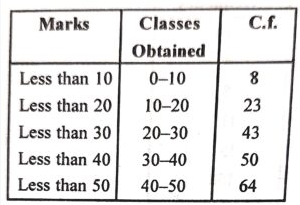
Plot the point (10, 8), (20, 23), (30, 43), (40, 50) and (50, 64) on the graph and join them to from an ogive.
Que-12: Draw an ogive for the following frequency distribution:
Class-interval |
10-19 |
20-29 |
30-39 |
40-49 |
50-59 |
Frequency |
21 |
15 |
12 |
19 |
8 |
Sol: Class interval in exclusive form and cumulative frequency is –
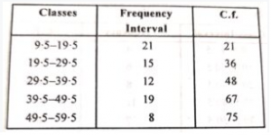
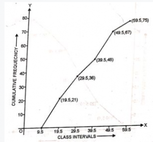
Now, plot the point (19.5, 21), (29.5, 36), (39.5, 48), (49.5, 67) and (59.5, 75) on the graph and then by joining them to get an ogive as shown-
Que-13: Draw a ogive …………………… following data .
| Class-interval | 1-10 | 11-20 | 21-30 | 31-40 | 41-50 | 51-60 |
| Frequency | 4 | 6 | 8 | 11 | 7 | 5 |
Sol: Class interval in exclusive form and cumulative frequency is –
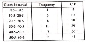
Now, plot the point (10.5, 4), (20.5, 10), (30.5, 18), (40.5, 29), (50.5, 36) and (60.5, 41) on the graph and then by joining them to get an ogive as shown-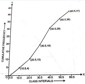
— : Graphical Representation of Statistical Data Class 10 RS Aggarwal Exe-24 ICSE Maths Solutions :–
Return to :– RS Aggarwal ICSE Class 10 Solutions Goyal Brothers
Please, Share with your friends
Thanks




2 thoughts on “Graphical Representation of Statistical Data Class 10 RS Aggarwal Exe-24 ICSE Maths Solutions”
Why arent some chapters’ solution not posted…………………….PLS POST
ok